Buyagift.
Driving revenue by helping people choose better gifts.
The Challenge: The voucher redemption journey sent recipients straight to their gifted experience with no clear path to discover alternatives or premium options.
The Strategy: Reframe a revenue target into a user-centric journey. One that helped recipients discover and upgrade to better experiences.
The Result: +15.5% similar exchanges, +14.3% premium upgrades, and £180k in projected annual revenue.

Overview.
Buyagift is one of the UK's leading gift experience providers where people buy and redeem vouchers for experiences, from spa retreats to off-road racing. While the purchase journey was well optimised, the post-purchase side of voucher redemption wasn't delivering on its commercial potential.
The business had a high-level OKR goal: grow revenue from recipients. As the sole designer in a cross-functional squad, working alongside my PM and six engineers, it was my focus to turn that into a user-centred design challenge.
Early discovery.
The project started with a discovery session between myself and my Product Manager. Rather than jumping straight to solutions, we took stock of what we actually knew about the redemption journey and what we were assuming.
After mapping the journey it became clear the entire flow was built around a single assumption that recipients wanted to redeem the experience they'd been gifted. The only moment in the journey that acknowledged they might want something different was at the very end, buried deep within the product description page...

We formed a hypothesis: recipients weren't necessarily redeeming the "right" gift, but the current flow made exploring alternatives too difficult. We reframed the challenge into:
"How might we encourage recipients to effortlessly explore and upgrade their experience without adding friction for those wanting a quick redemption?"
Research.
To pressure-test our assumption, I audited the existing journey and dug into the analytics.
There was a 38% drop-off between the voucher login step and recipients actually redeeming an experience — a significant loss at a stage where intent should have been at its highest.


To understand whether that drop-off was a journey problem or simply a lack of interest, I ran a customer survey targeting recipients at the point of redemption. Embedded on the product page via Hotjar, it gathered 163 responses giving us a clear read on what recipients actually wanted.
36% said they were open to exchanging their gift, often for a higher-value experience. Yet the actual exchange rate sat at just 10%, which told us the demand was there but the journey wasn’t supporting it.
To understand how others had approached similar problems, I also reviewed how platforms across travel, retail and subscriptions handle moments where users might want to explore alternatives. The most effective surfaced choices early and made exploration feel like an opportunity rather than a diversion.
Ideation.
I facilitated a workshop with my PM and engineering team to explore how we might intervene in the journey. Several directions came up.

The most obvious was improving visibility within the existing product page — surfacing exchange options more prominently without adding a new step. This issue though, was it still assumed recipients wanted the gifted experience before offering an alternative (which was the exact assumption we were trying to challenge).
A more ambitious direction was personalised recommendations immediately after login, tailored to voucher type or category. Scoring as a high-effort feature, it required recommendation logic that would significantly increase complexity.
What we kept coming back to was a lightweight decision point immediately after voucher login. Early enough to surface intent before any assumptions were made, and simple enough to build and test cleanly.
This was what became our Intent Page.


The solution.
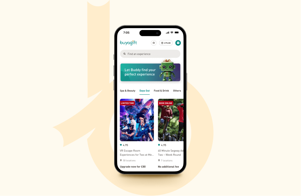
The design centred on a single principle: surface the choice without forcing it.
This interstitial introduced a clear hierarchy — a primary CTA to continue with the original voucher, and a secondary path for those open to something different. Neither option felt like the wrong choice.
To encourage exploration, the page included a carousel of category-matched experiences for recipients who wanted to browse more widely. Relevant enough to feel personalised, simple enough to reduce cognitive load and keep the decision easy.
I worked closely with engineering, managing handoff and keeping implementation aligned through regular check-ins across my two teams.

Results.
The Intent Page was A/B tested over three weeks against the existing flow, run as a 50/50 split. These results demonstrated significant improvements, with the variant showing:
- +15.5% increase in gift exchanges
- +14.3% uplift in recipients selecting higher-priced experiences
- -11% reduction in drop-offs at the decision point
- £180k projected in additional annual revenue from increased recipient conversion
The results validated a full rollout and confirmed that a single, well-placed design intervention could meaningfully shift both user behaviour and commercial outcomes.
Next steps.
The Intent Page proved that surfacing choice at the right moment could meaningfully shift behaviour, even with a relatively small design change. But it also opened up a broader set of questions about what that journey could become.
The immediate opportunity was personalisation, moving from a static set of recommendations to a dynamic experience tailored to preferences, past behaviour and category trends. Rather than showing everyone the same options, the page could learn what a recipient is likely to want and surface it before they even start browsing.
Analysis of recipient behaviour showed that those who exchange (particularly those who uplift) are measurably more likely to become future paying customers. The Intent Page was a UX win to increase revenue, but it was also creating a pipeline. Every premium exchange is a step towards turning a one-time gift recipient into a long-term customer.


View more projects