Doctorlink.
Helping patients understand their health with confidence.
The Challenge: A clinically robust health assessment platform was losing 90% of users before completion because the experience was difficult to navigate and understand.
The Strategy: Redesign the platform based on patient research, creating a clearer mobile-first approach without compromising its clinical integrity.
The Result: Completion increased from 10% to 42%, drop-off at the results stage fell by 61%, and the product was licensed by three enterprise insurance partners.

Overview.
Doctorlink is a digital healthcare platform used by GP practices, insurers and healthcare providers across the UK. Alongside online triage and consultations, it offered clinically validated Health Risk Assessments covering lifestyle, nutrition and long-term health.
While the clinical engine was robust, the patient experience had evolved around function rather than user needs. Navigation was confusing, results lacked context, and the product had never been designed around mobile behaviour. Only one in ten users completed an assessment, limiting the value patients received and weakening the platform’s commercial proposition as Doctorlink prepared it for wider enterprise adoption.
Working alongside Product, User Research, Clinical and Engineering, I led the redesign from discovery through to implementation.
Discovery.
Our original brief was a top level objective to improve assessment completion rates.
The prevailing assumption was that patients were abandoning because the questionnaire was too long. This seemed plausible as the assessments were comprehensive and naturally required time and attention, but shortening them risked compromising their clinical value without addressing why people were leaving.
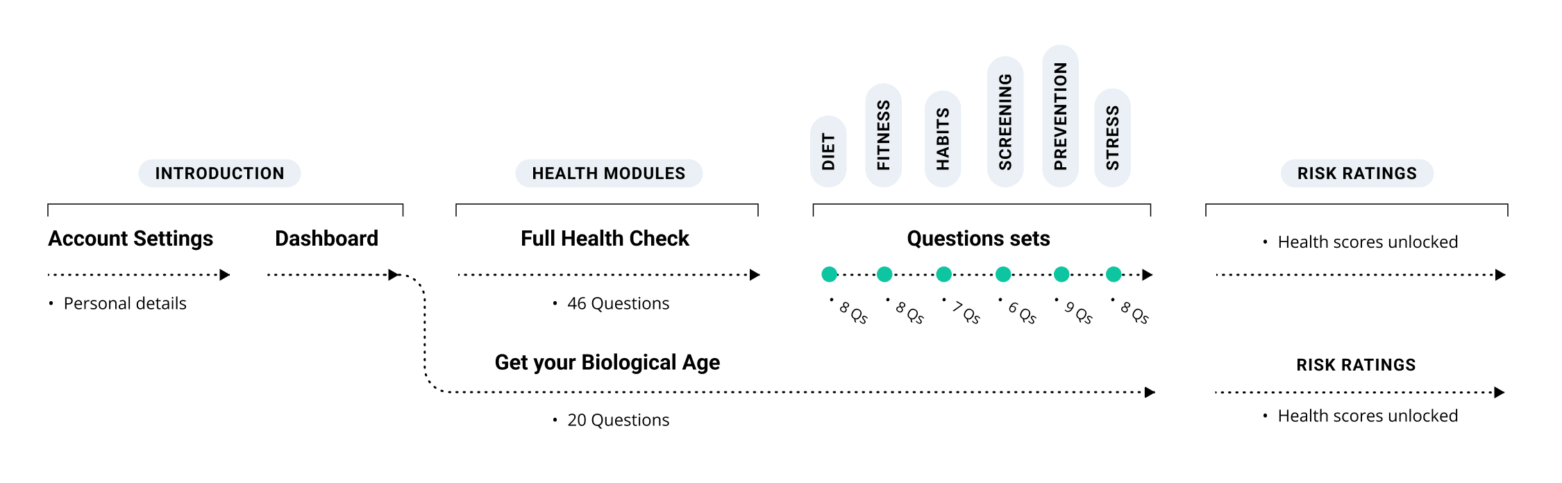
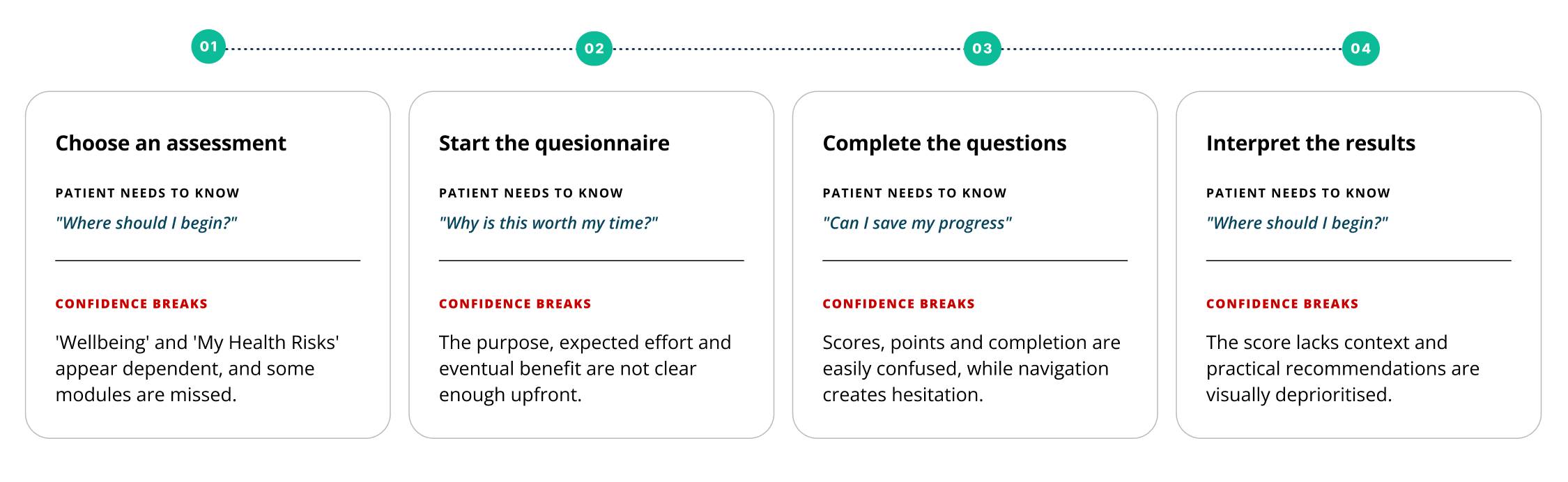
I mapped the existing journey and overlaid behavioural data to identify where abandonment occurred. Although users left at different stages, drop-off was particularly noticeable around early moments of uncertainty, such as choosing between assessment categories and understanding where to begin.
This challenged our initial assumption. Length wasn’t the only reason patients abandoned the assessment; they were also leaving when its structure or value became unclear.
Rather than reducing the number of questions, we focused on helping patients understand what they were being asked to do, what they would gain from completing it, and how we could guide them more confidently throughout their journey.
Research.
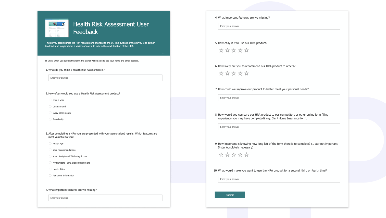
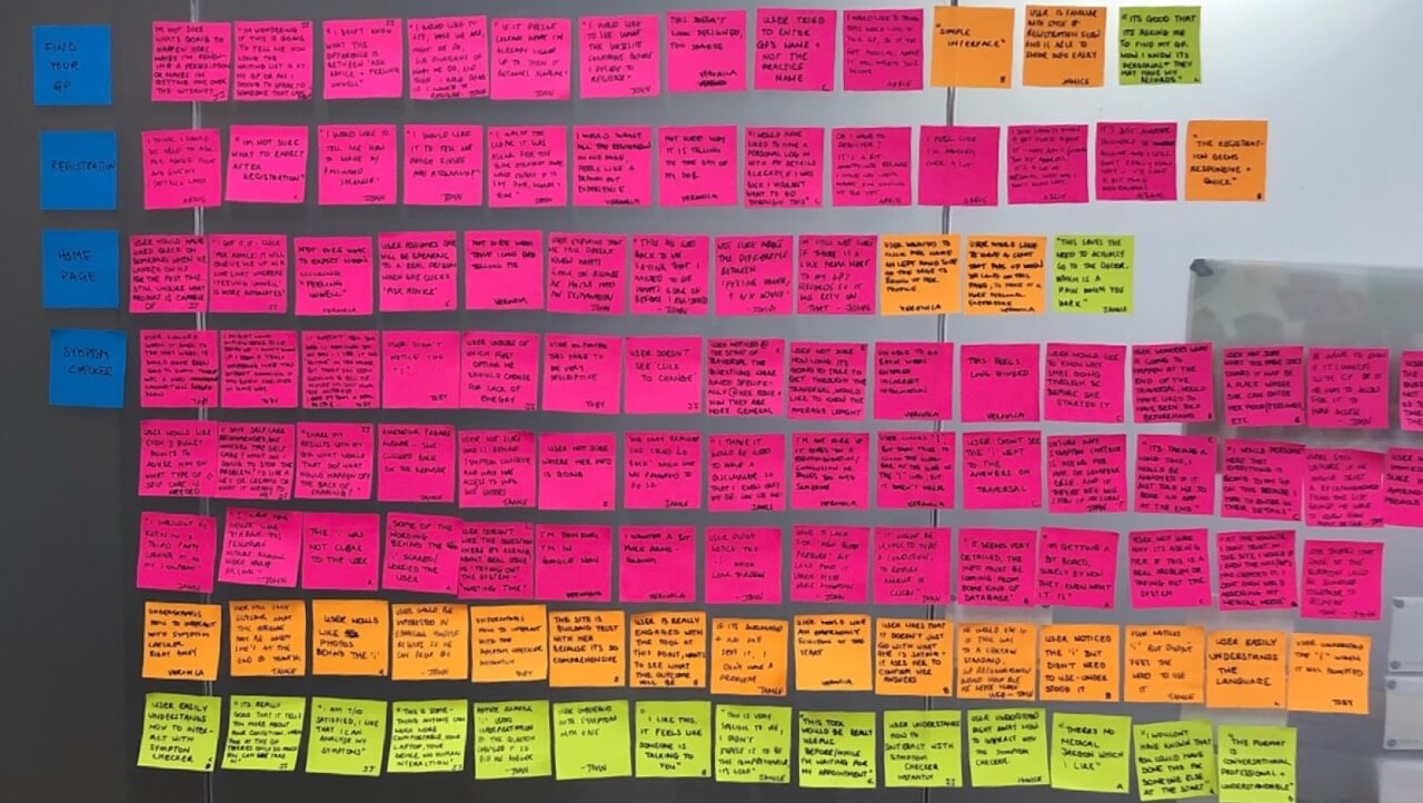
Working with my User Researcher, we structured a round of moderated research with five participants. This combined discovery questions with comparative usability testing to understand how people wanted to use a health assessment and where the existing experience was creating friction.
Participants were open to regularly completing a health assessment if it provided useful, actionable feedback. Motivation existed, but the product wasn’t communicating that value early enough.
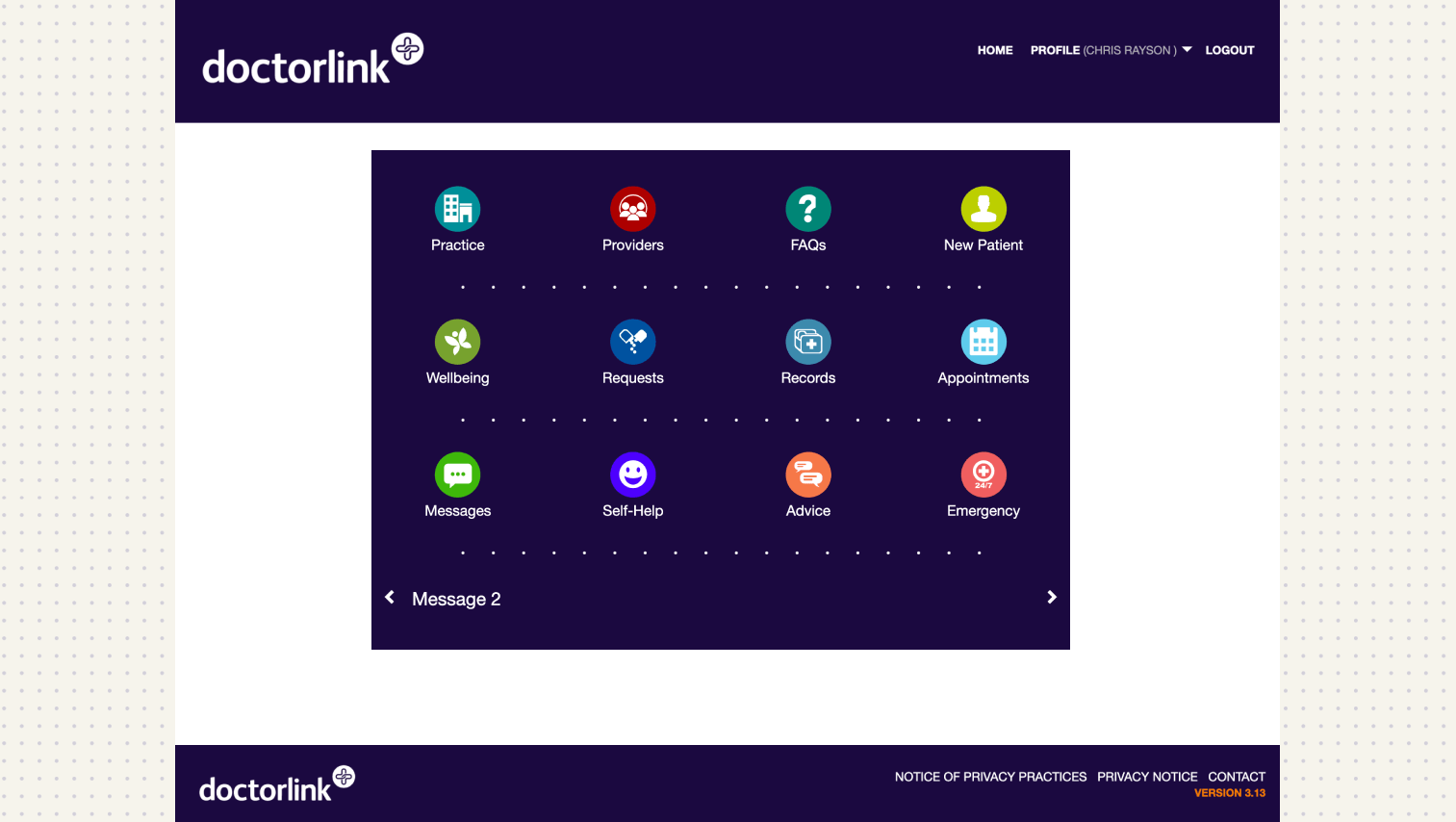
Three recurring problems emerged: The dashboard divided assessments into “Wellbeing” and “Self-Help”, an internal distinction that made little sense to patients. Some assumed one section depended on the other, while several overlooked the health risk assessments entirely.
The final results experience created even greater uncertainty. Participants struggled to understand what their score represented, or what they should do next. One interpreted the score as their progress through the questionnaire rather than a health outcome.
Navigation and content hierarchy also introduced hesitation. During one session, a participant paused and said: “I don’t really know where to get started.”
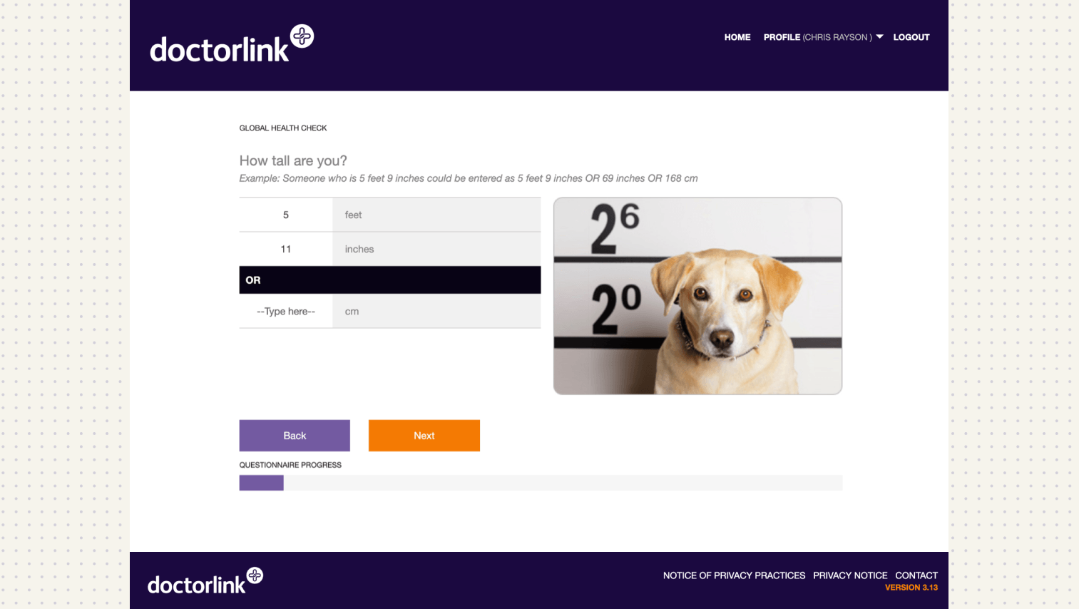
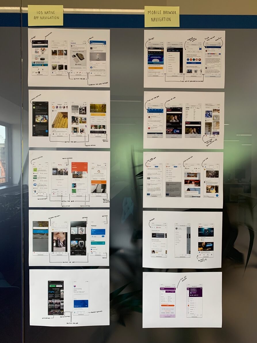
All five participants saw mobile as their preferred way to complete the assessments. As the existing platform had been designed primarily for desktop, this gave us a clear reason to reconsider the experience mobile-first.
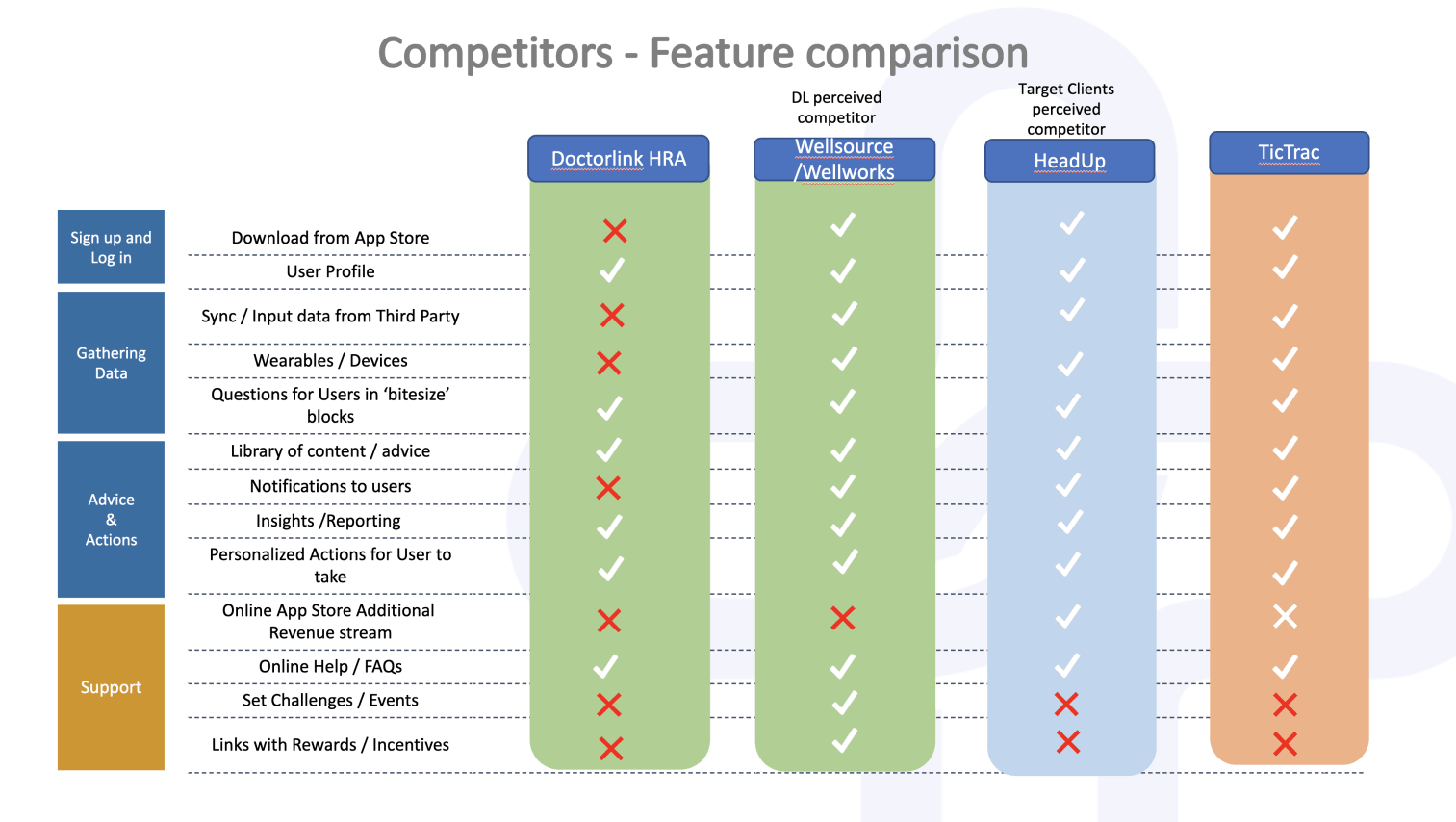
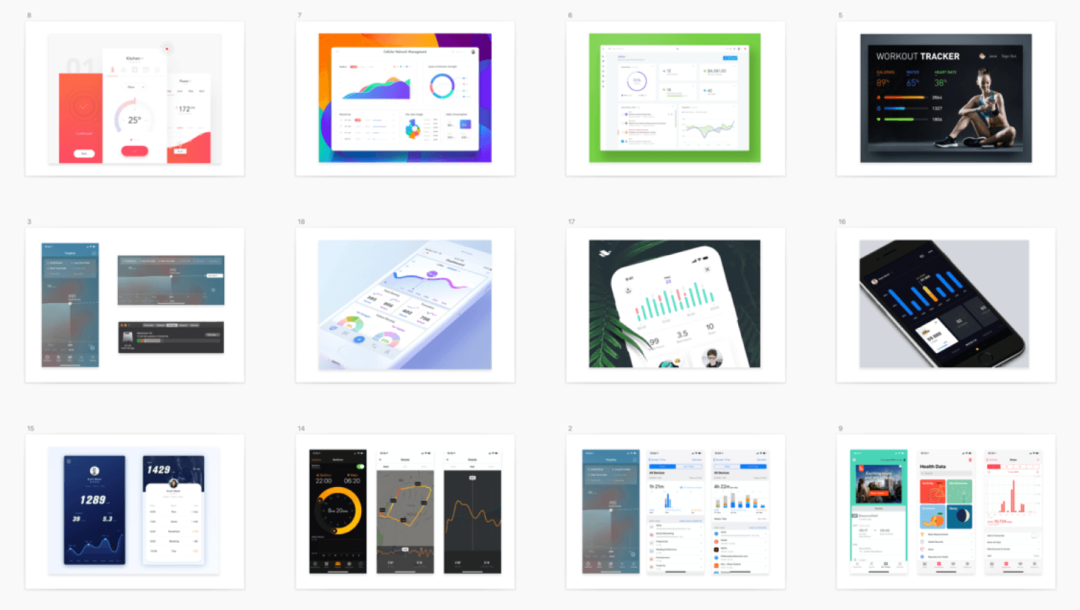
Benchmarking comparable healthcare, insurance and wellbeing products reinforced two principles: set clear expectations early, and turn results into practical next steps rather than presenting scores without context.
Ideation.
Facilitating a focussed workshop with Product and Clinical, we explored how we could improve comprehension without weakening the underlying medical model.
Because the structure was already in place, the most conservative direction focused on clearer labels, revised copy and better score explanations. This would reduce some confusion, but it preserved the same information architecture and still expected patients to understand internal categories before getting started.
Reducing the number of questions was considered, but the clinical team needed to preserve the assessment logic underpinning the results. Research gave us a more productive route forward: retain the clinical depth while simplifying how questions were structured, explained and presented.
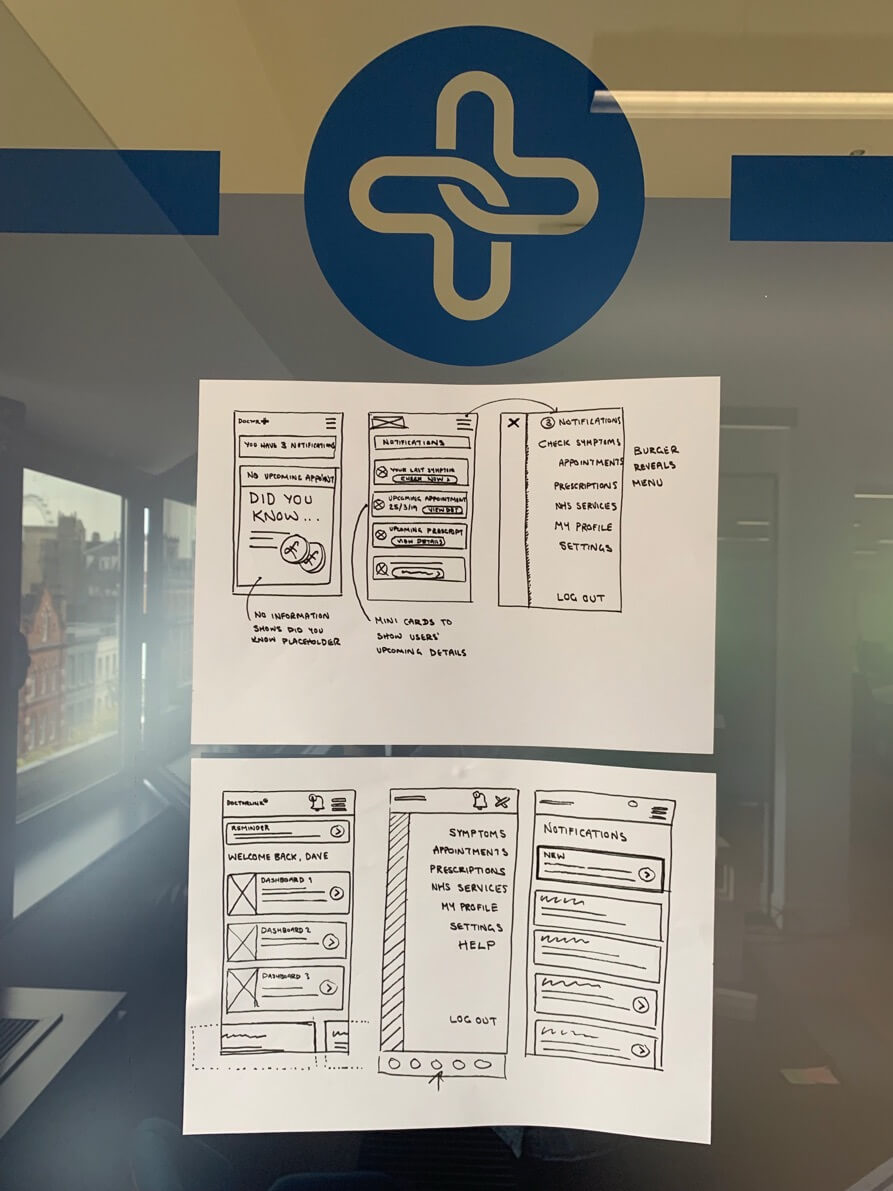
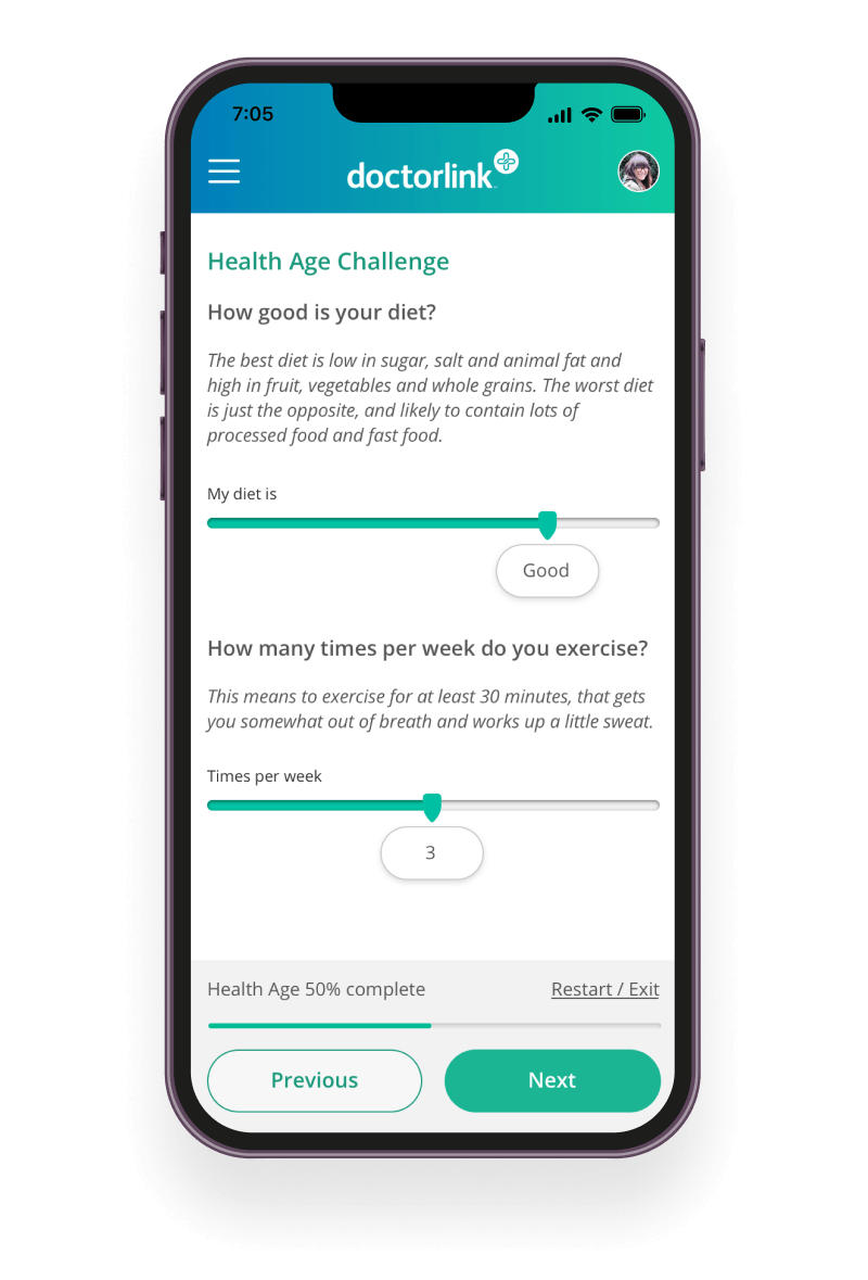
We prioritised a clearer assessment hub, more accessible language and question flows designed to reduce cognitive load on smaller screens. This addressed the most significant problems identified through research while giving us a foundation for a mobile-first redesign.
The solution.
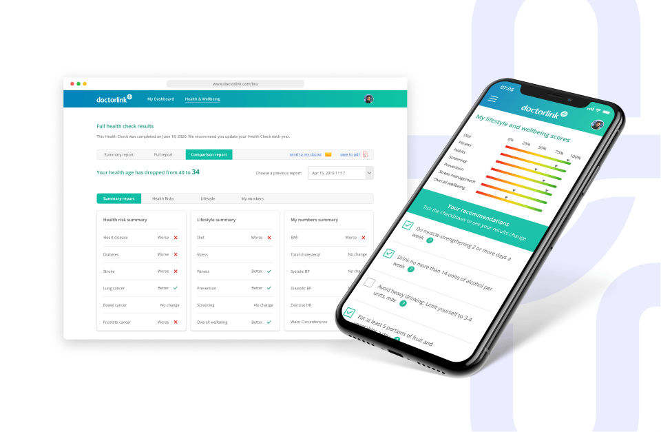
The redesign centred on a simple principle: make complex health information easier to understand without reducing its clinical value. Designed mobile-first with a fresh UI, the new experience guided patients from choosing an assessment to understanding their results, while preserving the full clinical model.
A clearer assessment journey
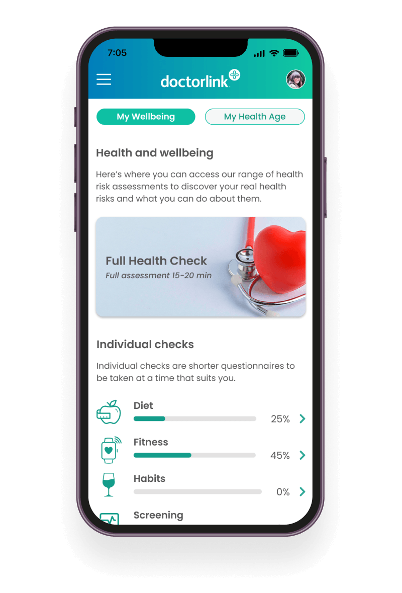
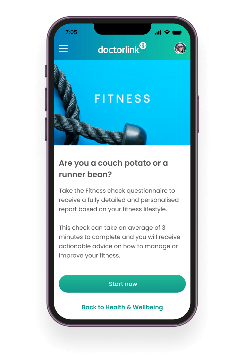
I replaced the dashboard with a single hub that presented every module together. Short introductions explained what each assessment covered, while clearer progress and navigation helped patients move through the questionnaire with greater confidence.
Results that explained, not just measured
I replaced isolated numerical scores with plain-English summaries explaining what each outcome meant, why it mattered and what patients could do next. Practical recommendations became the focus rather than supplementary information hidden behind additional interactions.
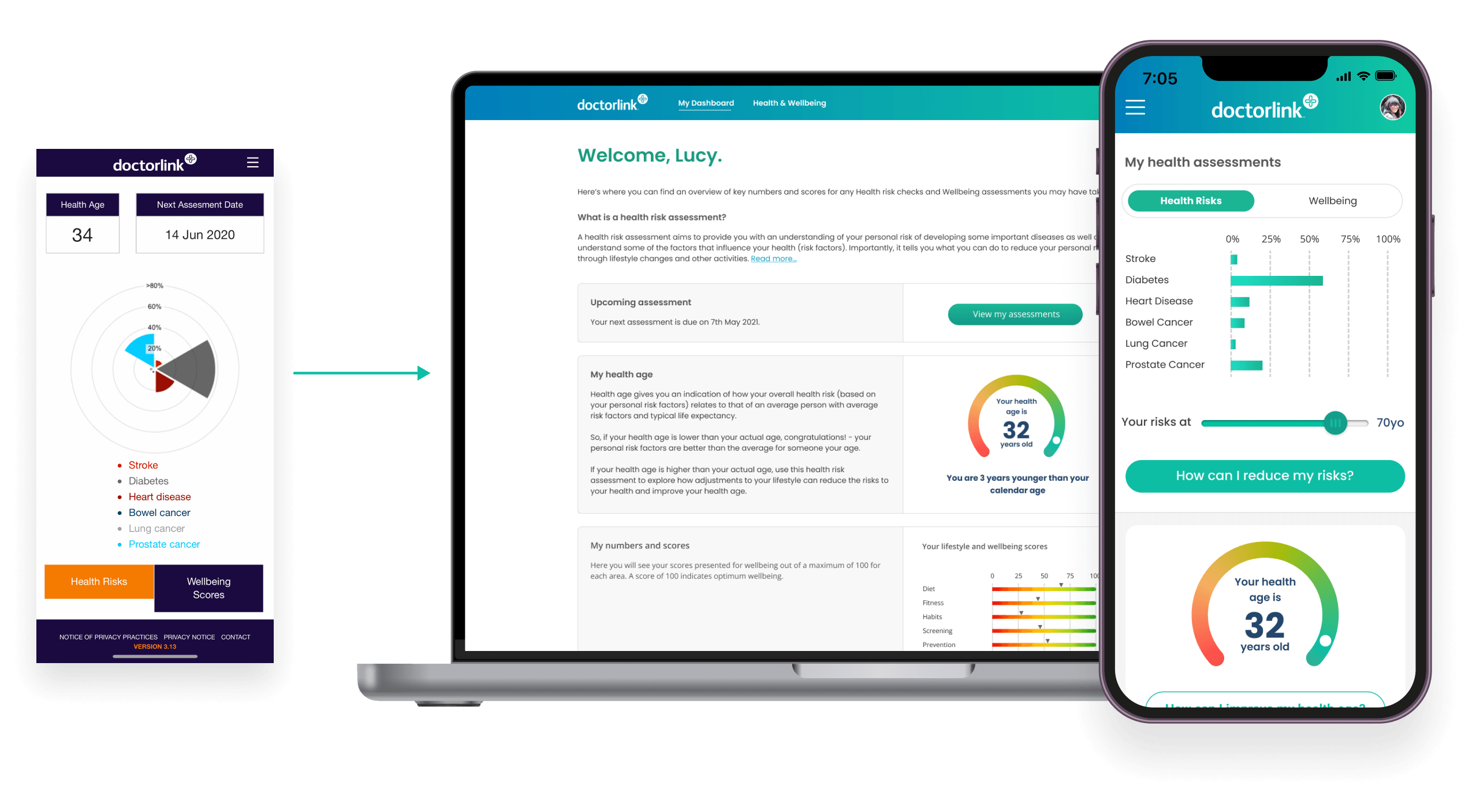
Following rollout, 78% of completed assessments took place on mobile. I also created a reusable component library and worked closely with Engineering to ensure the interaction patterns, accessibility considerations and clinical content translated consistently into production.
Testing and iteration.
A second round of unmoderated testing focused on whether the redesign had resolved the confidence issues identified earlier.
We wanted to learn if participants could navigate without support. Could they explain what their results meant? Did they understand what action to take next?
Participants navigated the revised structure more confidently and no longer assumed that assessment modules had to be completed in a particular order. The results were easier to interpret, and everyone responded positively to being guided towards another relevant module after finishing the first.
Testing also showed that some patients arrived at the dashboard with little understanding of the assessment’s purpose. I introduced a lightweight onboarding step that gave clearer context before they began.
Results.
- Assessment completion increased from 10% to 42%
- Drop-off at the results stage fell by 61%
- 78% of completed assessments took place on mobile
- Three enterprise insurance partners licensed the platform within twelve months
These improvements were achieved without shortening the assessments. By making complex information easier to understand, patients were more willing to invest their time.
What followed.
Further research identified practical opportunities beyond the initial release, including wearable integration, progress tracking and reminders that could help patients remain engaged with their health over time.
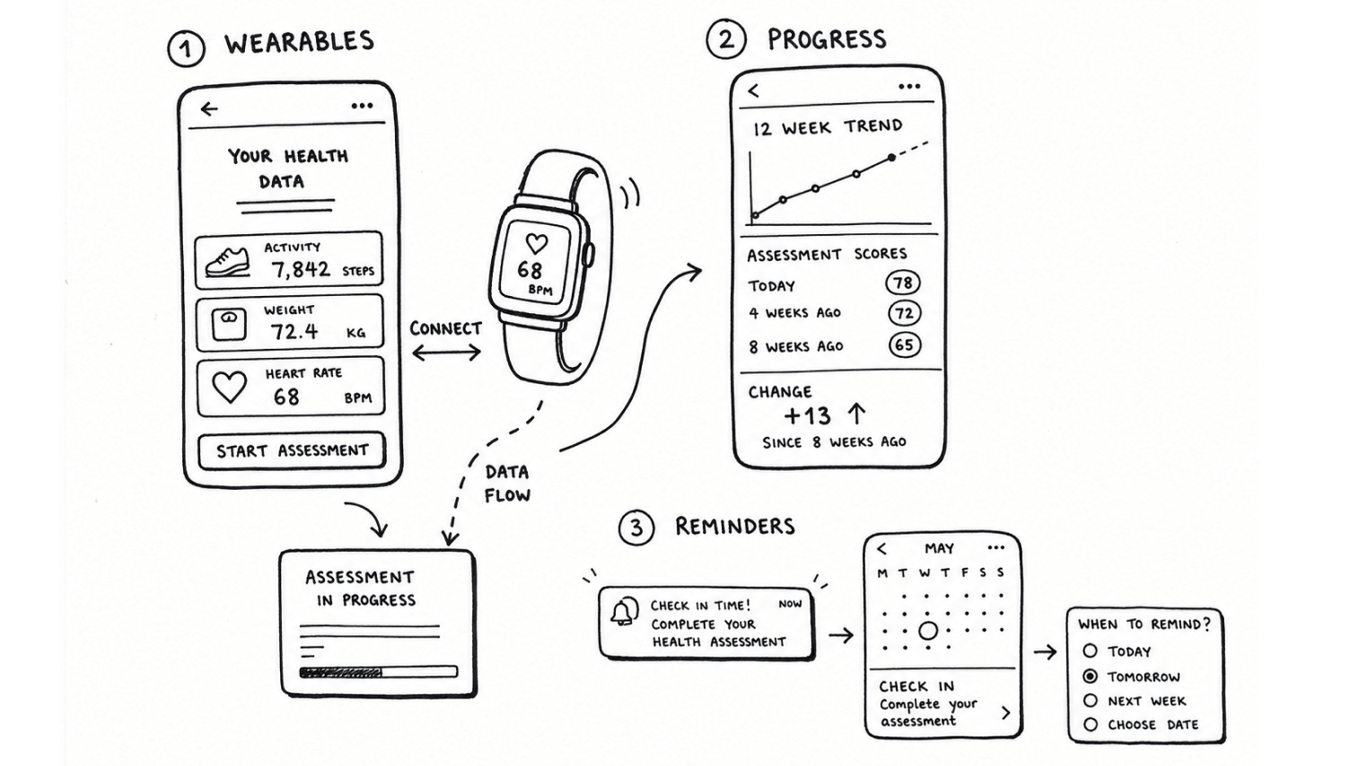
The redesigned product was white-labelled by three insurance providers and later used to demonstrate Doctorlink’s product capability during its merger with HealthHero. It also left me with a lasting lesson: simplifying a healthcare product doesn’t mean reducing its clinical depth. It means designing the surrounding experience so that complexity feels clear, purposeful and manageable.
View more projects