Global Media.
Guiding listeners to explore content more easily.
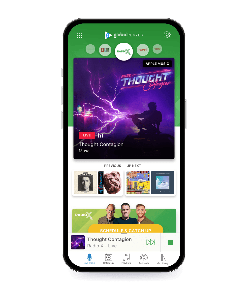
The Challenge: A vast library of brand content sat invisible behind the now-playing screen, with in-app advertising engagement only at 3%.
The Strategy: Reframed the optimisation of click-through rates into a structural design problem, addressing content architecture that brought discovery to the surface.
The Result: Advertising engagement doubled to 6%, daily reach up 15%, listening hours up 9%.
Overview.
Global Player is the cross-platform home of Global's nine radio brands, reaching over 21 million monthly listeners across multiple touchpoints and part of a broader weekly radio audience of 29 million. With advertising revenue increasingly tied to in-app engagement, the ultimate goal was to convert passive listeners into engaged app users.
Embedded in a large cross-functional team of analytics, content, engineering, and product, I led discovery, ideation workshops, prototyping, testing, and engineering handoff — alongside delivering podcast artwork and promotional materials across the nine brands
Early discovery.
The brief arrived as a straightforward commercial objective: increase click-through rates on in-app brand content. Advertising engagement was sitting at around 3% which is low for a platform with the scale and loyal base of repeat users it had. Before jumping to solutions, I wanted to understand why.
I partnered with my PM and analytics team to audit what we understood about how the app was being used. I mapped the journey and initially assumed that once someone opened the app they’d naturally keep exploring, although everything in the data said otherwise. I began research to dig deeper into behavioural data.
"Oh I thought that took me out to the website!"
Research.
Working with our analytics team to pull session-level behaviour and running a parallel round of qualitative interviews with listeners, I found 68% of sessions ended without a single interaction beyond the now-playing screen, yet users in the following interviews expressed genuine interest in brand content once it was placed in front of them.
I found my answer during user testing. A quote that stuck with the whole team "Oh I thought that took me out to the website!" came from a listener explaining why they'd hesitated to tap the main CTA inside the app. Some listeners explained they sometimes ran the app in the background and weren't actively viewing their phone, but largely the UX was essentially generating doubt about where actions would lead, and listeners were choosing inaction as a result.
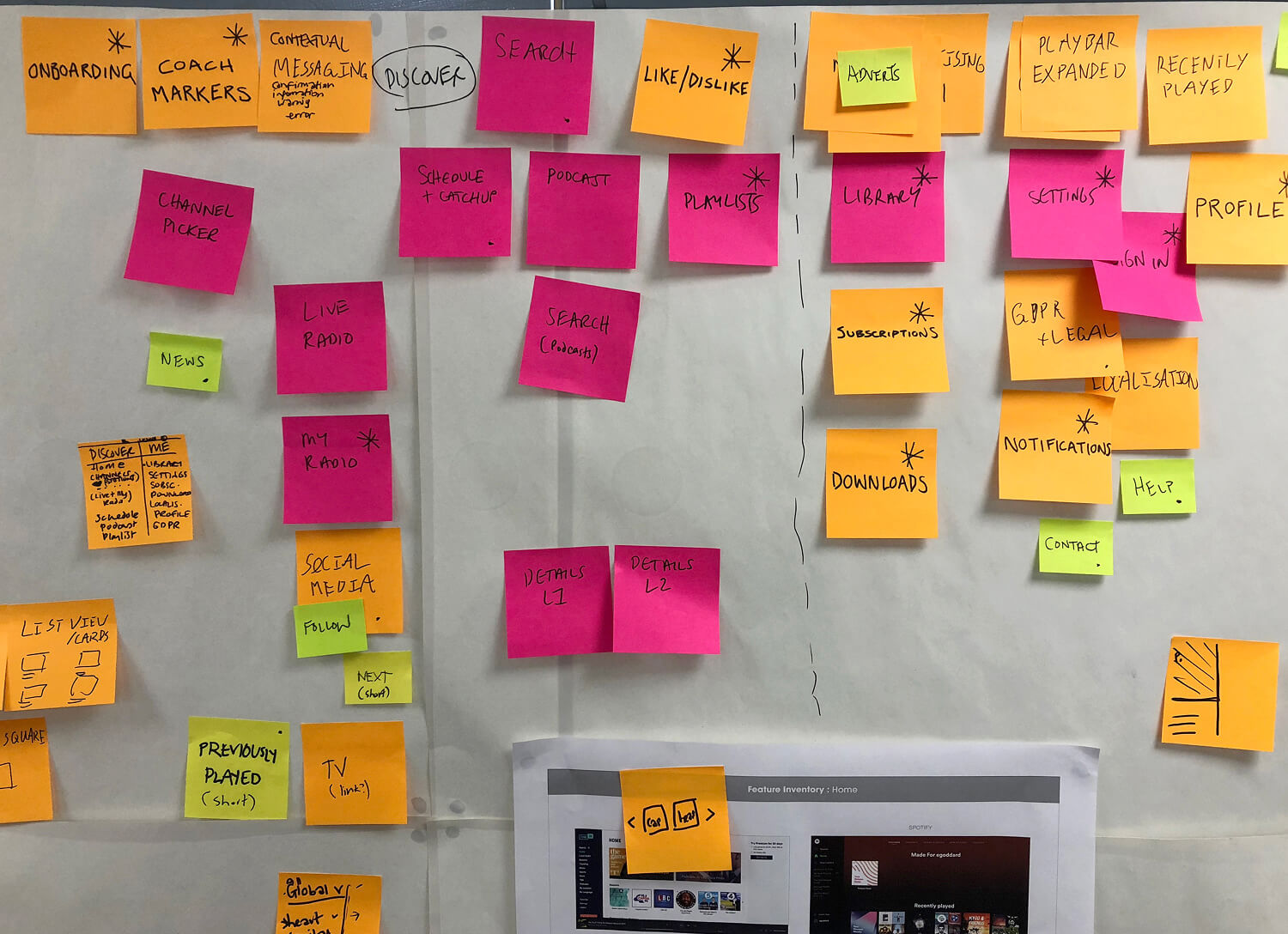

With a clearer hypothesis in hand, I turned to benchmarking how similar platforms handled the same challenge. Spotify's browse tab, BBC Sounds' catch-up scheduling, Apple Music's curation hub all gave a clear understanding of what made content feel accessible versus buried. The pattern across most platforms showed that putting content on the path was far better than asking users to go looking for it.
This now became more a content discovery problem rather than a click-through rate issue
Ideation.
I ran an ideation session with my PM, engineers, and members of the leadership team. We came at it from several angles from sketches to written notes which were posted on our wall for everyone to have full clarity.
The most conservative option was to reduce the size of the station picker and utilise the dead space within the now playing screen. We agreed this could accommodate new content and encourage exploration alongside a UX copy revision to the CTA. The potential issue was it would still require users to seek things out, just with slightly better signposting.

At the other end of the spectrum was a personalised content feed, algorithmically ranked by listening history and the kinds of shows a user had already shown interest in. Scoring high in impact, it also scored high in effort due to significant engineering complexity and a dependency on recommendation logic we didn't yet have.
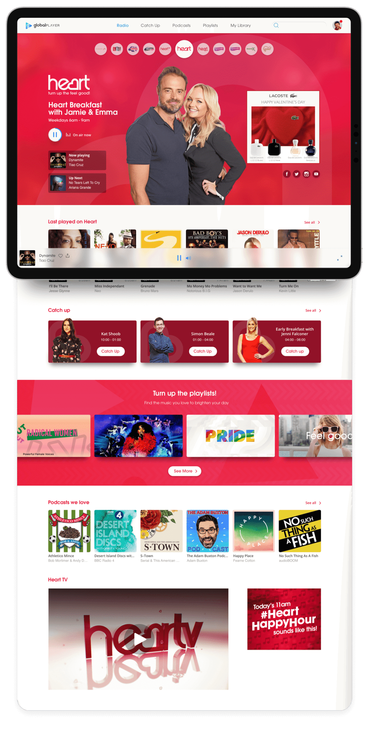
A relatively mid-effort, high impact idea was to give each station its own dedicated space. A single page that brought everything together and reachable from the top level. No longer ring-fenced, we could surface the live player, catch-up, and playlists all in one place.
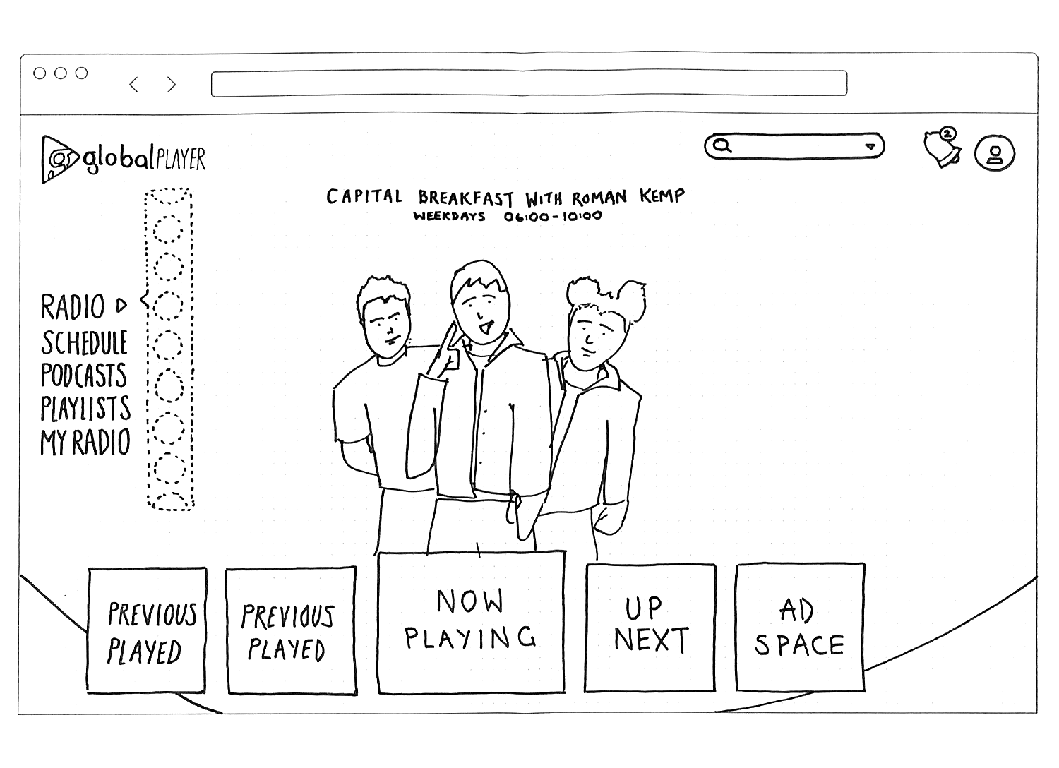

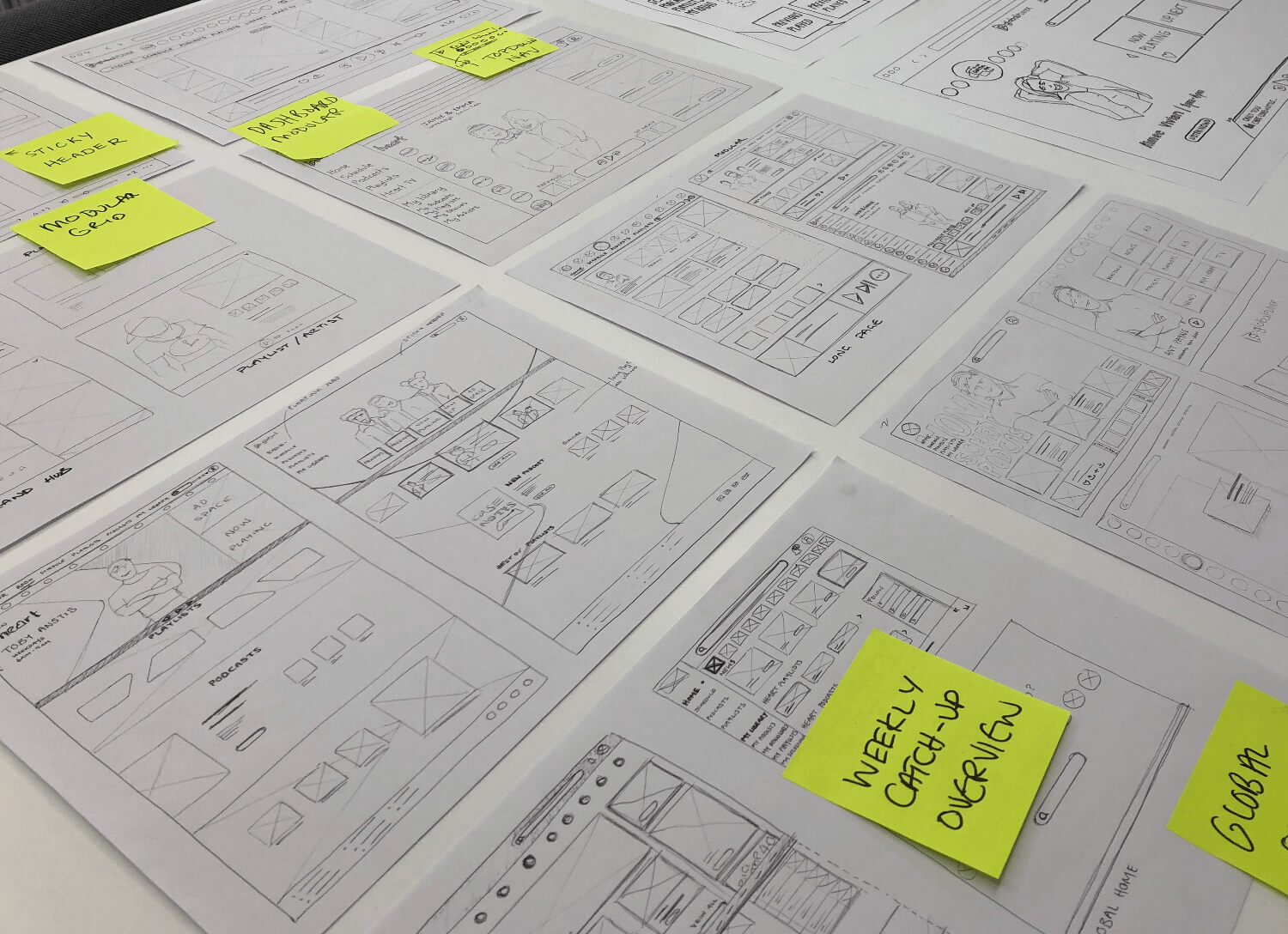
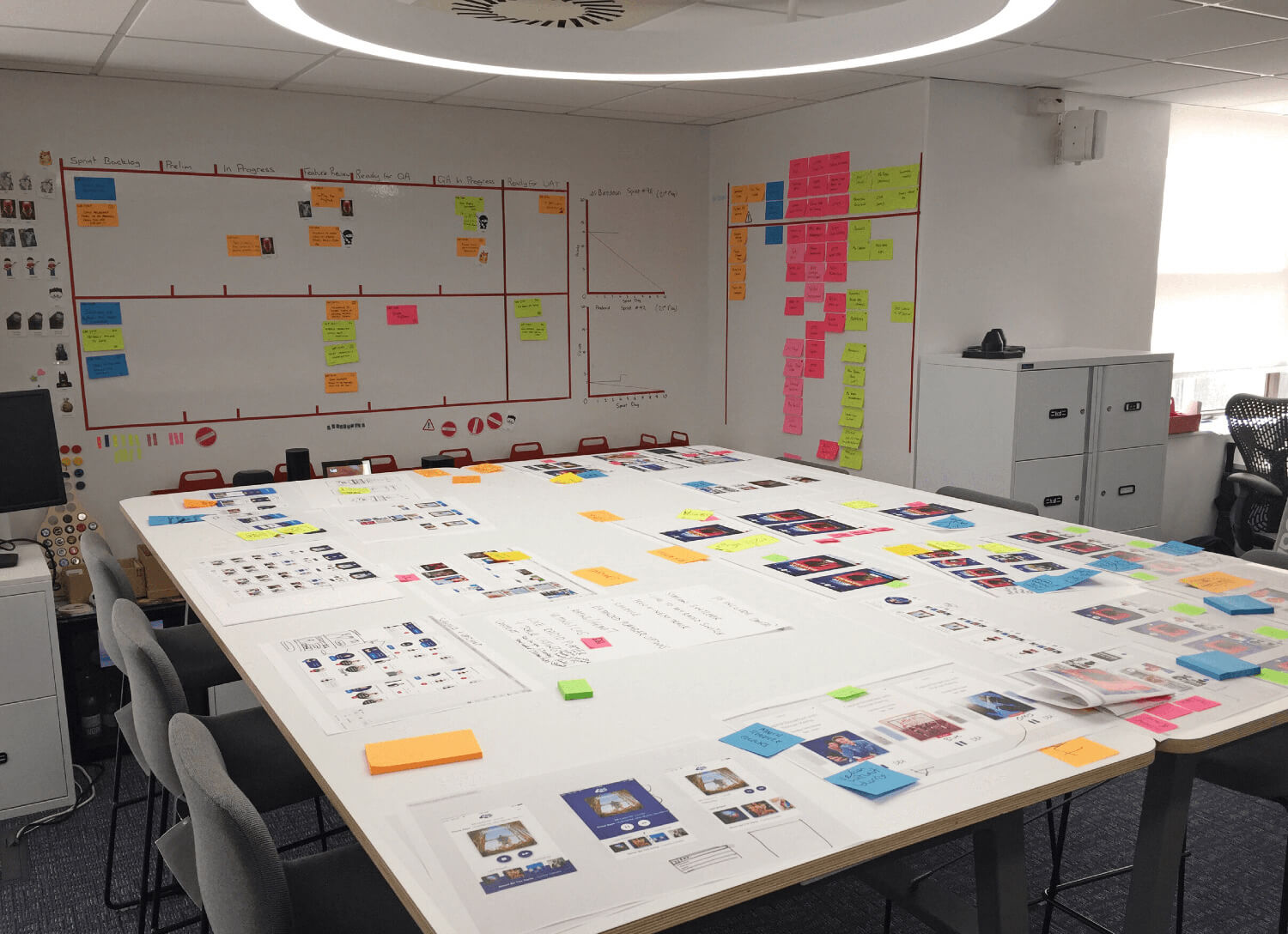
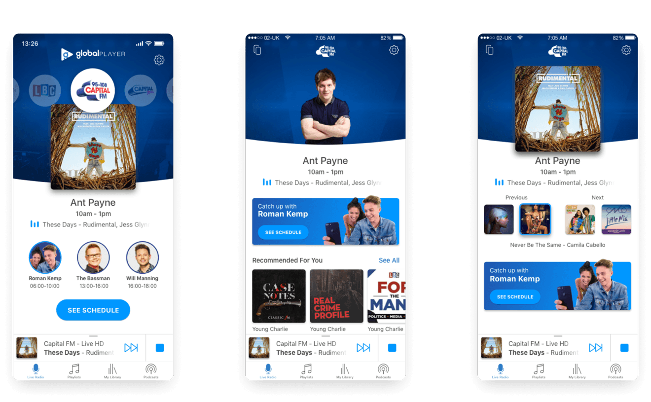
Iterations of the home hub concept
The solution.
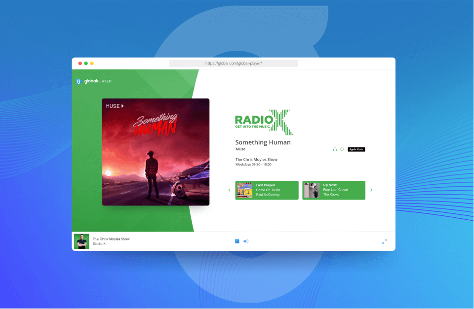
I deliberately organised the experience around listeners’ natural journey, keeping the live player as the primary anchor while surfacing catch-up, podcasts and supporting content in a logical order that encouraged exploration without disrupting listening. I also introduced “next up” functionality directly into the player interface, and simplified labels to better reflect users’ mental models, reducing ambiguity and making navigation feel more predictable.
The schedule and catch-up module did exactly what we'd hypothesised. Follow-up testing showed listeners naturally used it as a scroll entry point, leading them to discover content that had previously gone unnoticed.
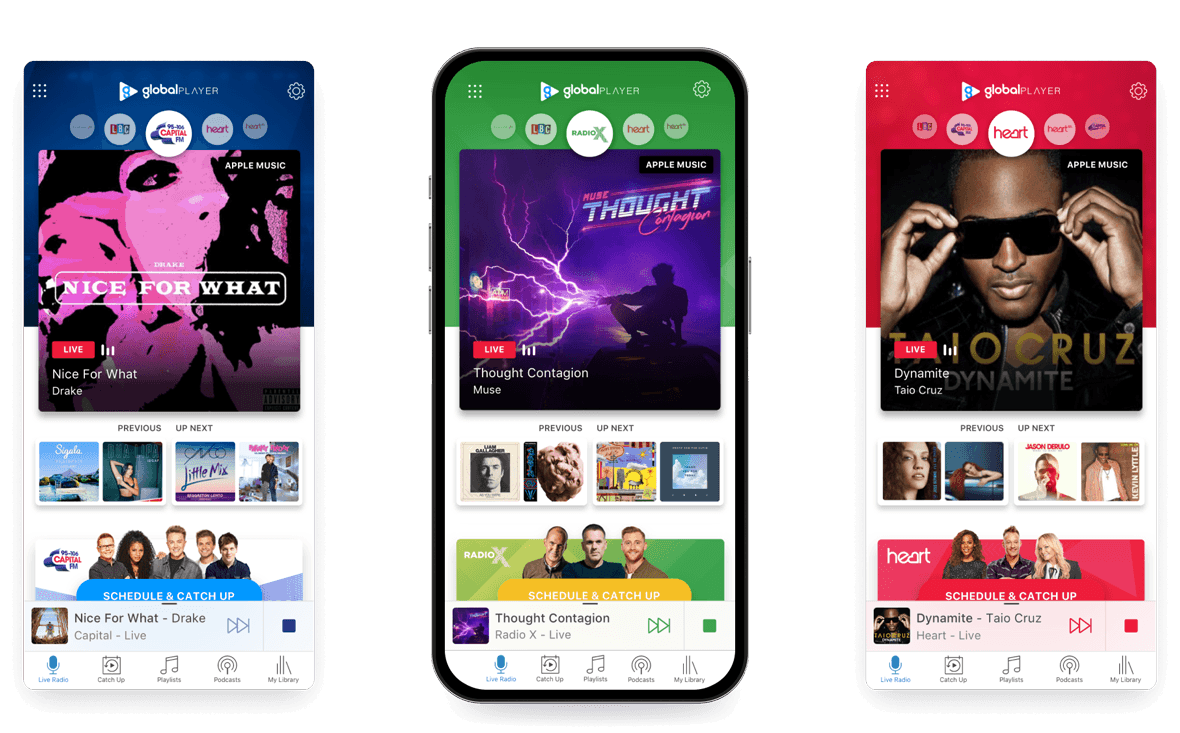
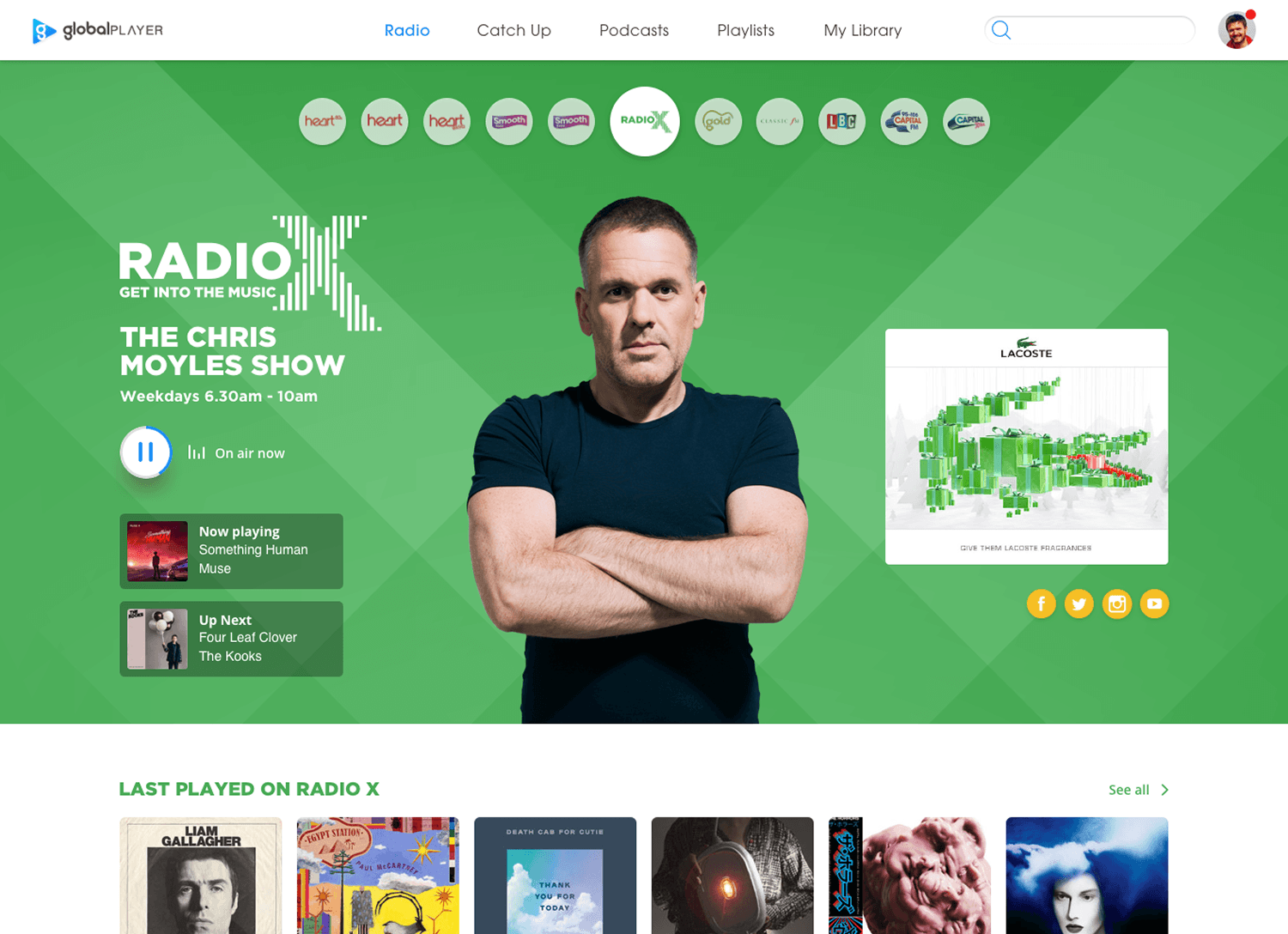
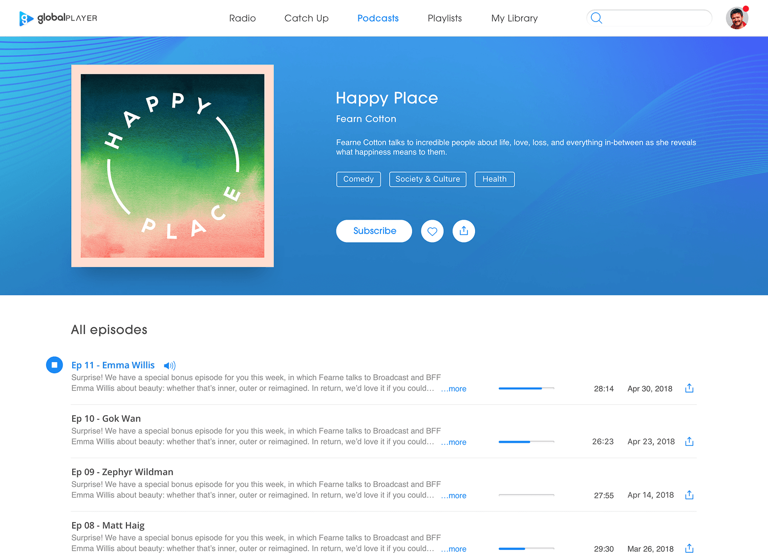
With the core flow validated, I produced high-fidelity designs for our team to implement across all nine of Global's brands, ensuring the hub held together as a system while respecting each brand's character. Shared layouts, reusable components and consistent interaction patterns meant each station felt familiar to navigate while retaining its own visual identity.
The process also prompted a tooling change: the design & engineering team had been working through Invision & Zeplin which had become a bottleneck. I proposed trialling Figma, ran a demo, and subsequently made the switch, improving collaboration speed and significantly reducing back-and-forth on implementation queries.
Results.
The redesigned Global Player delivered measurable improvements across multiple metrics:
- Advertising engagement doubled from 3% to 6%
- Daily reach up 15%
- Listening hours up 9%
The app was also now structurally ready to include an incoming podcast feature. The hub model meant new content types could be introduced through the same discovery layer we'd built, reducing future design and engineering overhead.
Next steps.
Beyond the results, data revealed that listeners who engaged with station content came back more often and listened for longer. At Global’s scale, even relatively small improvements in engagement translated into meaningful increases in long-term value.
The natural next step is personalisation. Global iD is the platform's identity system that holds listening history, preferences, and behavioural signals. The infrastructure for dynamic content recommendations is in development and the next step is using it to transition the hub from a static screen to one that adapts to who's listening and when.
View more projects